For the final post of our 3-part series on the new UI, let's talk about the changes for the Administrators. Of course, you'll see the same new look, new buttons, and styles as the Applicants and Evaluators. And, you'll get the benefits of a mobile responsive interface should you happen to be working away from the office. Let's take a look.
Navigation Changes
We still have the menu at the top of the page for system-wide functions, such as Programs, Support, etc. We've renamed Users to People for a more friendly approach. Plus, we've grouped the Program Library and Create New Program actions as selections under Programs. Under Settings, you'll find the Account Settings (e.g. Account Plan, Organization Info, etc.). Plus, we have a new Access Settings which is giving you a sneak peek of some upcoming features (e.g. Google and Facebook Authentication, Single Sign-On). Those features are still in development and not active, but we will be releasing them soon. More to come!
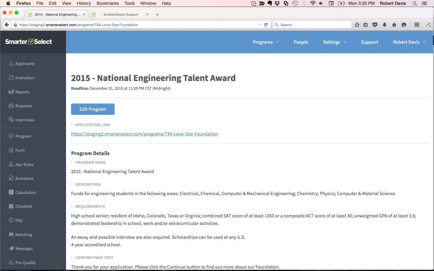
Of significant note, we've moved the Program level functions from the right column to the left and we've re-organized them. We've grouped the most actively used functions when a program is active, specifically the Applicants and Reports functions. Then, we've grouped the lesser-used, setup or configuration functions to the lower part of the column. We also re-named Application to Form to better define that function.
Tables 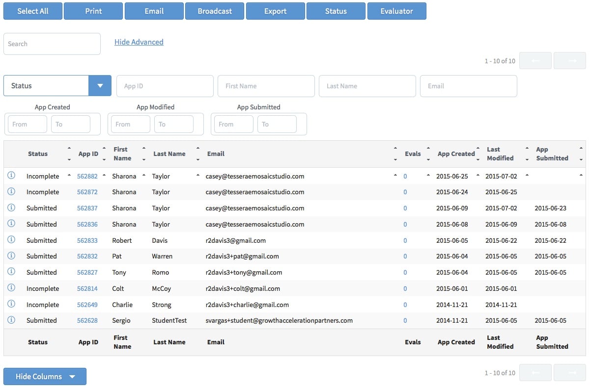

Our tables have gotten a lot more interesting. Let's look at the Applicants table since it is one of the most used. Just as we've done on the My Applications and My Evaluations tables, we've added the text search box which searches ALL columns for the text string provided. When you've got hundreds or thousands of applicants, it's a quick way to find a particular applicant.
We've also replaced the column filters in the old table style with the new Advanced Search filters. These are more easily evident and usable than the last style.
And finally, you will now select rows for export, printing, status changes, etc. by clicking directly on the row or clicking the Select All button. Each row selected will be highlighted in light blue to indicate its selection.
We are still investigating the power of this new table technology and we expect additional enhancements in the future.
New Email Designs
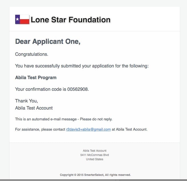
Finally, we've redesigned the email layouts to improve readability and provide a cleaner look.
More to Come...
Over the next few weeks, we'll be fixing anything we missed and making adjustments. Plus, we'll be implementing some new print layout styles. For example, above is a sneak peek at the new WYSIWYG (what you see is what you get) print layout.
Please let us know via our support site if we missed anything or have any suggestions.

