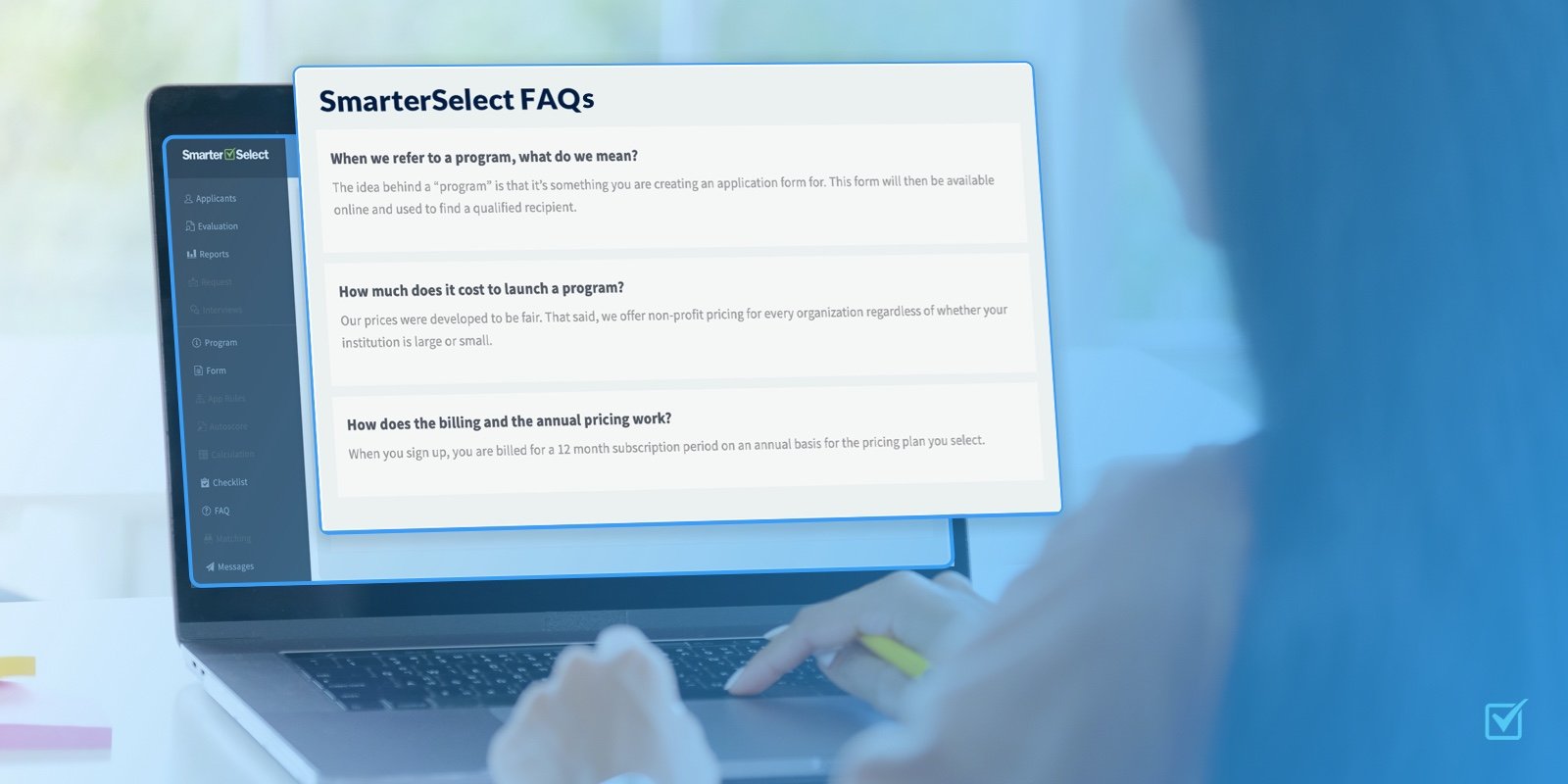
Better application management of scholarships, grants, awards, and more.
So, what will my Applicants and Evaluators experience?
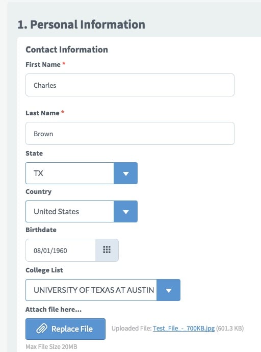
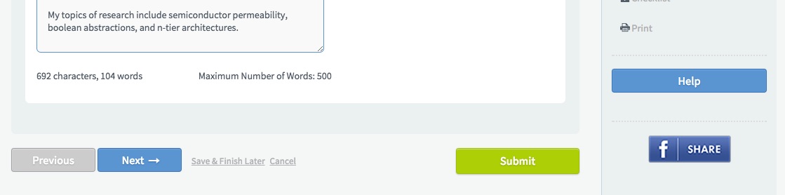
Following many hours of research and evaluation, we discovered that the overall layout of the Applicant and Evaluator pages was quite optimal. So, your users will pretty much find everything where it was before. For example, the questions are on the left side of the screen with the page navigation and options such as Print are in the right column. However, the users are getting an even cleaner look than before. Let's take a look.
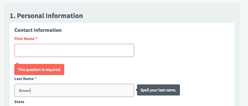
New Border and Icon Styles
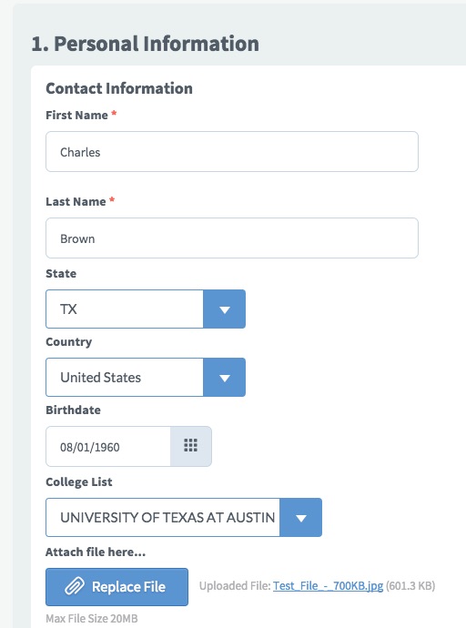
New Button Styles
New Alerts for Errors and Help
Mobile Responsive
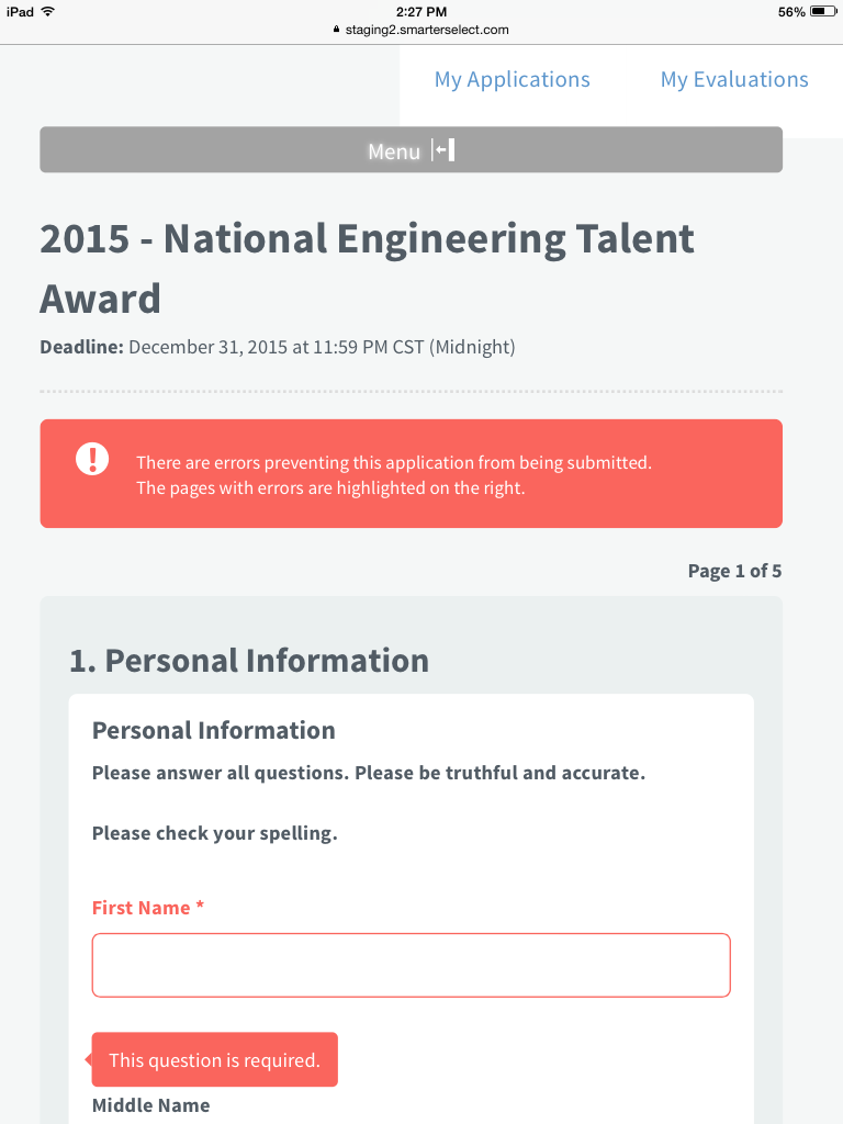
One of the coolest features we've added is making the SmarterSelect service mobile responsive. This means that the screen will modify dynamically according the screen size of the user's device. For example, in the screenshot above, the user is on an iPad Mini. The right navigation column has now been "collapsed" into a "Menu <-" option at the top of the screen. Clicking this "Menu <-" button will expand or collapse the right column accordingly. If the user is on a smartphone, then the horizontal menu bar (e.g. My Applications, My Account, etc.) will be collapsed with another Menu button option. Additionally, any text on the screen will "wrap" to fit the size of the screen.
Text Search on Tables
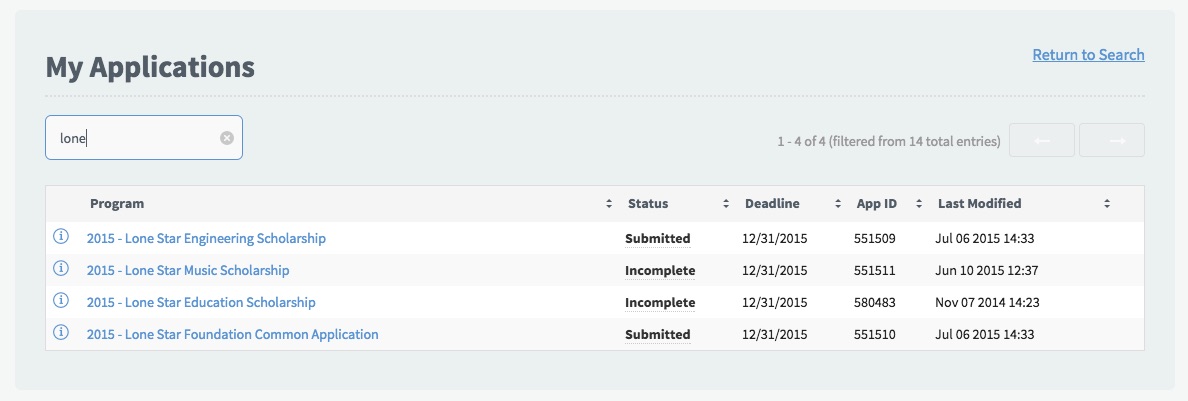
For both Applicants and Evaluators, we've added a text search box at the top of their respective My Applications and My Evaluations tables. So, the user can type any string of text and it will search across ALL columns of the table and display the results. In the example above, the user has 14 total applications. They typed "lone" and the table displays the 4 rows that have the text string "lone". We think this will come in handy for Evaluators that have A LOT of evaluations and they are looking for one in particular.
Improved Evaluator Navigation
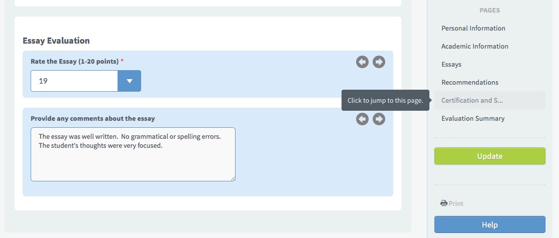
Not only do the Evaluators get a new look, they get some really neat navigation features. We now "lock" the right navigation and options column so that as the Evaluator scrolls up and down, the page navigation, Save, and Update buttons remain in place. Also, the Evaluator can click on the page title to "jump" to the desired page. We've also included the recently released, highly popular, "Next/Previous Evaluation" arrows which enable the Evaluator to jump quickly through the application without scrolling.
That's it for Applicants & Evaluators! Please let us know via our support site if we missed anything or have any suggestions.
Click here for the next blog post about the New UI - Administrators.
You might also like